Fig. 1
From: Splice_sim: a nucleotide conversion-enabled RNA-seq simulation and evaluation framework

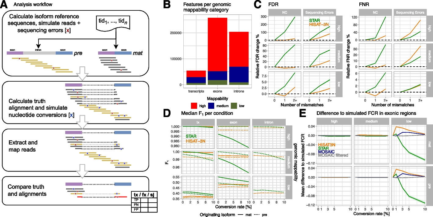
Analysis workflow and NC mapping accuracies for simulated mouse metabolic labeling data. A Analysis workflow overview: briefly, we simulated short reads with realistic sequencing error (red X) for premature and mature isoforms, calculated truth alignments, and injected nucleotide conversions with configured conversion rates. Simulated reads were mapped by the evaluated read mappers and resulting alignments were compared to the simulated data. Finally, grouped count tables with true positive (TP), false positive (FP), and false negative (FN) counts per annotation of interest (tx: transcripts, fx: exons + introns, sj: splice junctions) were created and analyzed. B Numbers of analyzed m_big annotations with high (> 0.9), medium, and low (< 0.2) mean genome mappability. C Changes of false discovery (FDR = FP/(TP + FP) and false negative (FNR = FN/(TP + FN)) rates by number of mismatches per read compared to reads without mismatches, stratified by mappability and type of mismatch (either simulated NC or random sequencing errors). The plots show median FDR/FNR and interquartile regions (shaded areas) across three m_big replicates for STAR (green) and HISAT-3N (orange) alignments. This analysis included ~ 12B reads originating from premature isoforms and their classification (TP, FP, FN) with respect to whole-transcript annotations. D Median F1 measure per mapper and originating isoform (pre: premature, mat: mature) for different genomic annotations (tx: whole transcript), stratified by mappability. E Mean difference to simulated, exonic FCR (fraction of converted reads) per mapper and for a “mosaic” approach where the mapper with the smallest difference to the simulated value was chosen. The mosaic approach reduces differences to simulated values and when removing exons where none of the two mappers showed good results, reconstruction is nearly perfect (“mosaic filtered,” see main text). Note that a corresponding plot for human data is provided in Additional file 1: Figure S6 for comparison
