Figure 2
From: MAnorm: a robust model for quantitative comparison of ChIP-Seq data sets

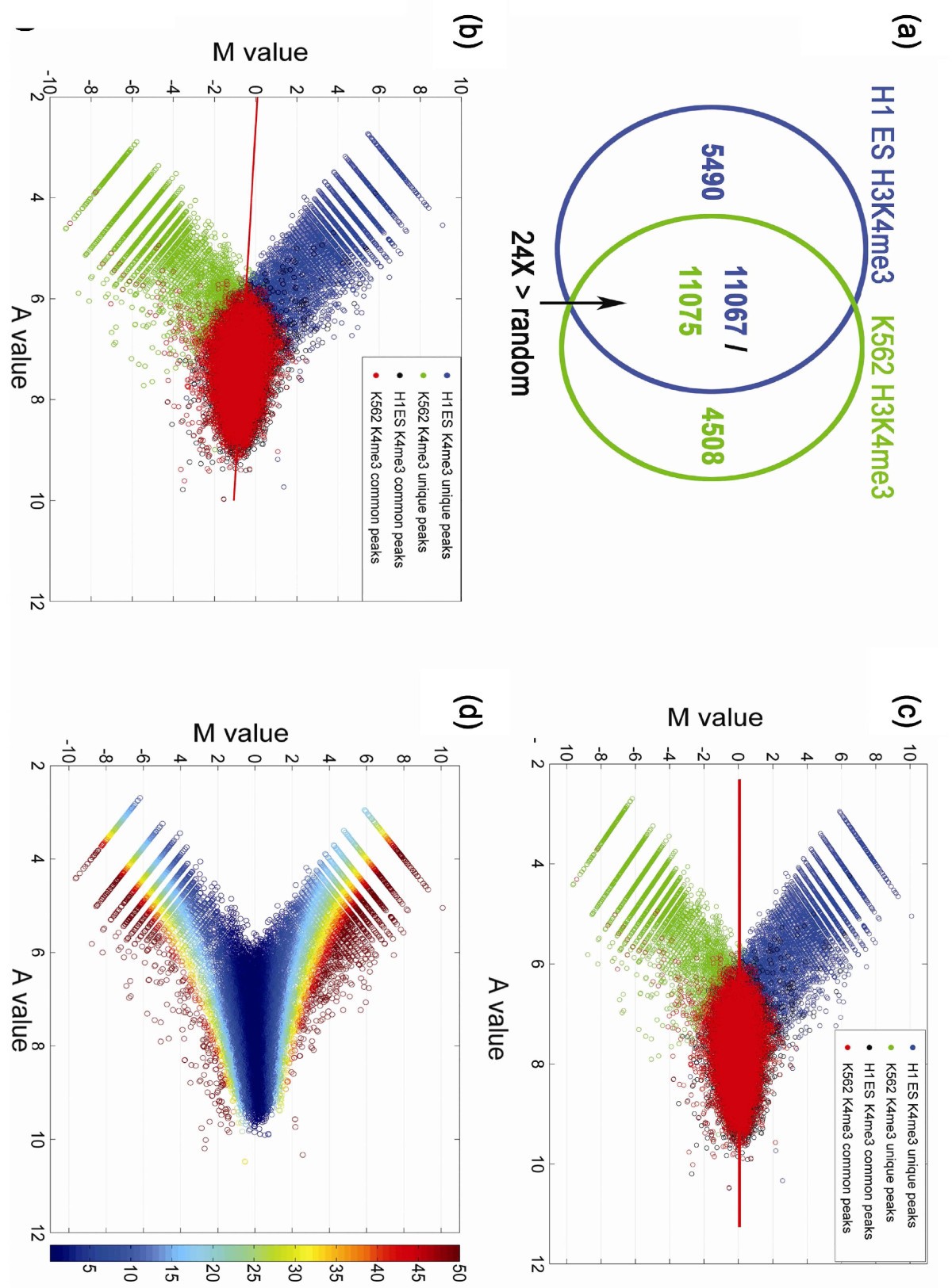
Normalization of H3K4me3 ChIP-Seq data in H1 ES cells and K562 cells. (a) Venn diagram representing the overlap of H3K4me3 peaks between H1 ES and K562 cells. The overlap of peaks between the two cell lines was 24-fold greater than that observed for random permutations of the peak sets. (b,c) MA plots of all peaks from both samples before (b) and after MAnorm (c). The red line is the linear model derived from common peaks by robust regression. Purple and green circles represent unique peaks; red and black circles represent common peaks. (d) P-values associated with normalized peaks, displayed as an MA plot, with the color range representing -log10 P-value. Most peaks associated with |M| > 1 have a P-value < 10-10.
